HEWI MAG / Knowledge
Architecture color concept: The positive effects of colors
It’s impossible to imagine our everyday environment without colors. They surround us ubiquitously. But what positive effects does an appealing color design in architecture have on people? Learn more about it in this post.
Even the famous architect Le Corbusier highlighted the importance of colors for architecture when he said: "Color in architecture is as powerful a tool as the floor plan and the layout."
Colors are a significant component in architecture, having a crucial influence on the effect of a building. For this reason, it is obligatory for you as a planner or architect to pay special attention to the color scheme of rooms and outdoor facilities. Using color concepts in architecture makes perfect sense. After all, colors serve as mood carriers and have been proven to have various effects on the human senses.
Healing architecture: How architecture contributes to healing
The color design of hospitals or care facilities has a positive impact on the recovery process and the well-being of patients as well as residents. It supports a homely atmosphere and influences the state of health as well as the mood and mental well-being in a positive way. Visitors also generally prefer to linger in facilities if they are colorfully designed and radiate a comfortable feeling.
Healing architecture has therefore long since arrived as an architectural concept in the planning of buildings. Colors are an important design element for this. This is because in questions concerning the central criteria of a hospital or nursing facility, the environment or equipment also plays a significant role in healing architecture in addition to patient care. A growing number of studies worldwide that explore influences of built space on interaction and behavior, on physical and psychological well-being, support this thesis of healing architecture.
Positive learning: How architecture promotes learning
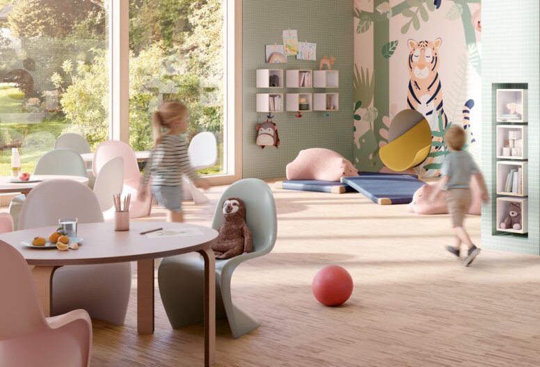
In addition to people who are ill or have physical limitations, children also benefit from an appealing color scheme. Especially in rooms where young people acquire knowledge, the color scheme affects the learning effect. It is important to create a positive environment that provides orientation and space for creativity. Positive learning, child-friendly architecture, and inclusion are pillars for sustainable educational concepts that offer benefits for all children.
The basic needs of children are safety and security. Schools and kindergartens should satisfy these needs. Since children perceive spaces differently than adults, it is important for you as an architect to give careful consideration to color design.
To put children in a positive mood in which it is easy to learn, cheerful and bright colors are ideal. However, the color scheme of a room also depends on the age of the children who primarily spend time there and should be adapted to their respective needs.
With the help of color concepts in architecture, it is possible to visualize important areas of a room even to the youngest children by highlighting products with color accents. For example, it is possible to use a colorful door handle to playfully show children where the functional area on a door is.
Be iconic. Be colorful.
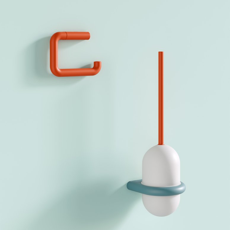
The 477/801 series from HEWI is a true classic that has been relaunched with exciting color combinations: Series 477/801 ICONIC brings emotion and color to architecture. The concept of the reinterpreted design icon is: Be iconic. Be colorful. With the targeted use of color, the newly designed products of the series influence the well-being in a room. Along with other colorful designs in the room, they promote recovery processes and provide a feeling of security. Thus, in harmony with other color accents, they create a relaxing and stress-free environment.
Be healing
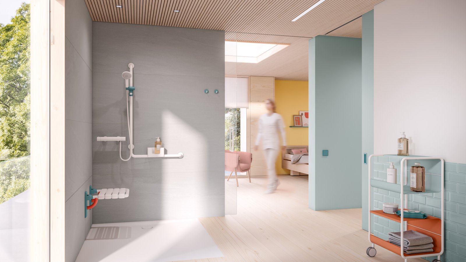
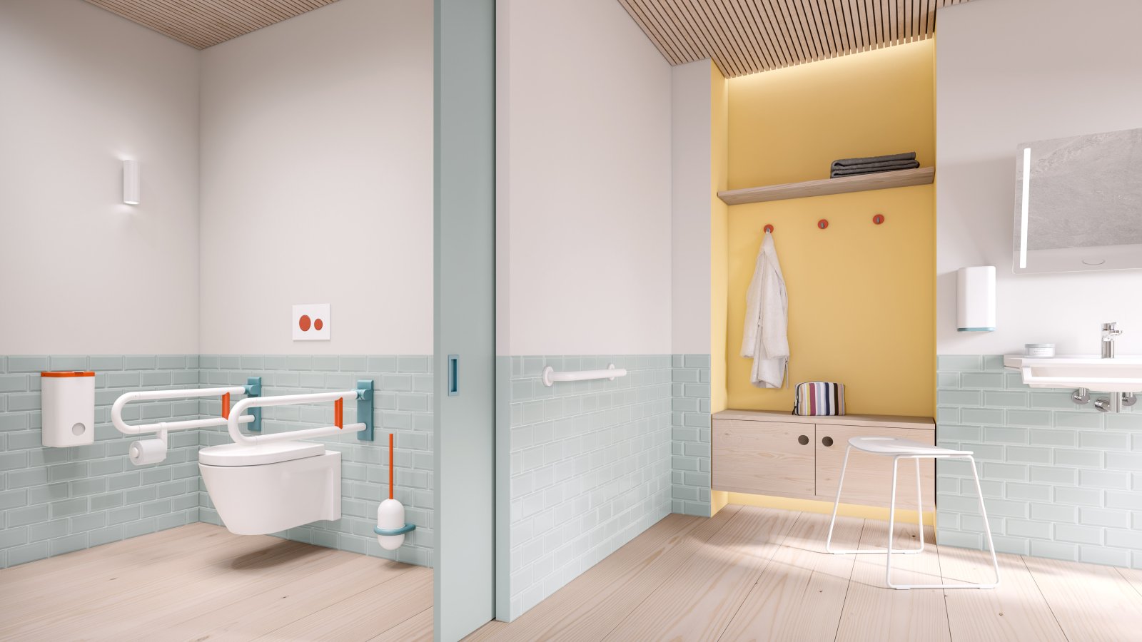
The color combination of coral, aqua blue, and pure white is very suitable for use in healthcare buildings. The combination of coral and aqua blue is reminiscent of warm, tropical climates with beaches and crystal clear water. The base of warm colors makes coral vitalizing and relaxing at the same time. Combined with white and aqua blue, the color concept appears enveloping and calming, mentally transporting viewers to a place of relaxation. The concept of healing architecture, among other things, led the way in the design of ICONIC products for healthcare buildings.

Series 477/801 ICONIC from HEWI skilfully sets accents. It signals the use and operation of the products. This is especially important when people no longer have unrestricted vision. Color-accentuated products help users find their way around better.
Be childish
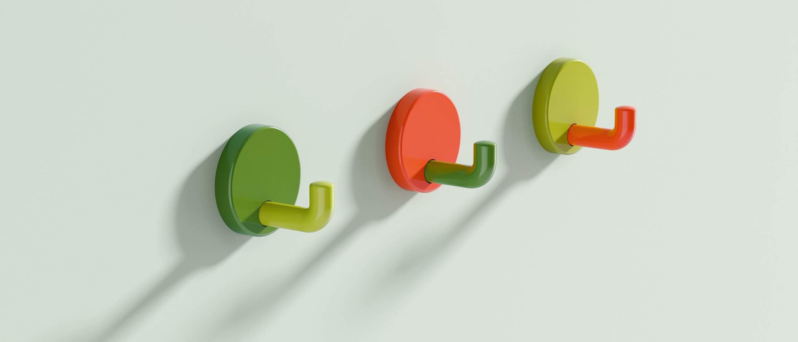
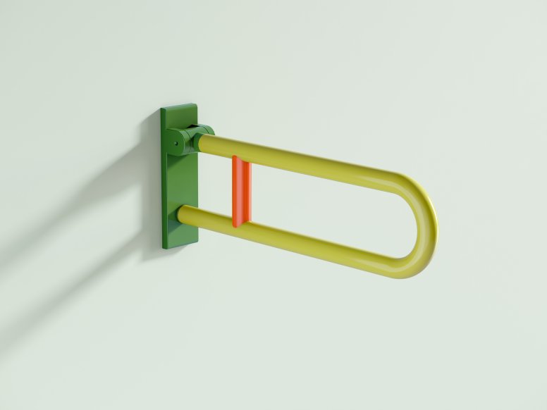
Two different color combinations of the HEWI Series 477/801 are available for kindergarten and elementary school furnishings. With the natural-looking shades of apple green, May green, coral, and aqua blue, as well as steel blue, HEWI offers two design options that add appeal to schools, kindergartens, or daycare centers.
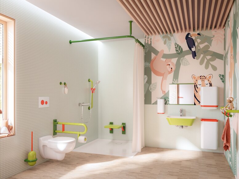
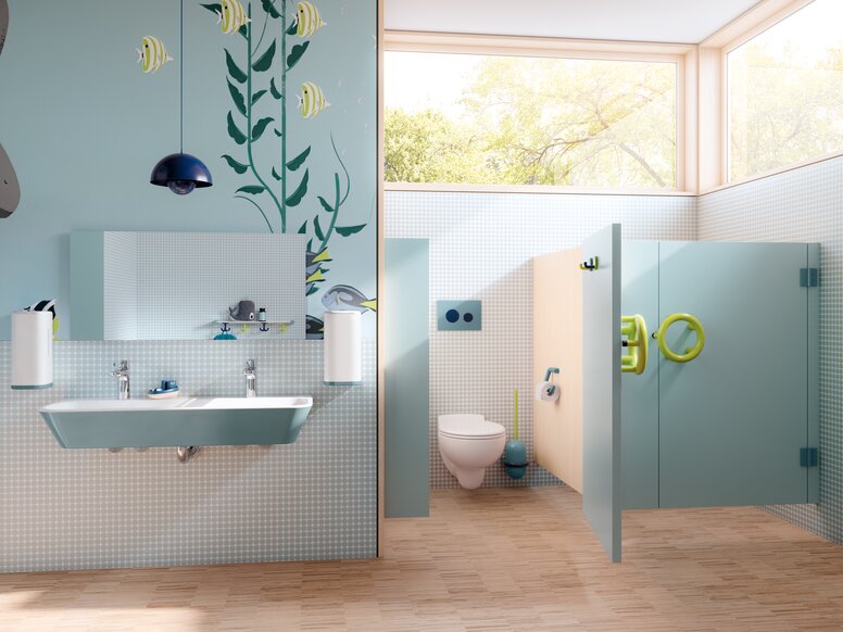

Bright, light shades of green have a relaxing effect. The proximity to nature exudes a sense of liveliness. The combination with the warm coral tone looks particularly harmonious. Clear, serene blue tones, on the other hand, promote concentration and have a calming effect. The colorful proximity to the sea radiates serenity.
Targeted use of colored contrasts makes it easier for children to find their way around and enables intuitive use. The functional elements of Series 477/801 ICONIC are highlighted to illustrate their function.
The products of series 477/801 ICONIC harmonize with the HEWI single washbasins and dispenser systems. In this way, they guarantee a uniform appearance.


Stay informed
Stay up to date with the free HEWI newsletter and never miss any news about the topics sanitary and building hardware.
