HEWI / Knowledge
Design philosophy by Michael Graves
In 2003, Michael Graves became paralyzed after a freak illness. For the next two years, he was in and out of 8 hospitals and physical rehabilitation centers. At his sickest in the hospital, Michael Graves famously said, “I can’t die here. It’s too ugly.” Throughout this long ordeal, he never stopped working. As a result, our design team experienced the indignities of convalesce in poorly designed healthcare facilities alongside Michael. It was at this moment that our firm recognized the overwhelming need to bring great design to healthcare environments.
As product designers, architects, and interior designers who have always focused on humanistic design, we knew we could improve healthcare experiences for patients, family members and professional caregivers by designing products, furniture, interiors, and healthcare facilities that look better, work better, and are uplifting. This became our firm’s shared passion, and it offered Michael a means to turn his personal tragedy into a transformative improvement for society. Our firm remains dedicated to carrying on this most important facet of Michael’s legacy.
Our design process begins with research. When designing for healthcare environments, we observe and interview patients, family members, doctors, nurses, transporters, cleaning, and maintenance staff, in order to understand everyone’s needs and wants, and to learn what works well and what creates challenges. We organize and synthesize the qualitative data using design frameworks like stakeholder journey maps. This process brings to light opportunity gaps, as well as areas that may be in conflict among stakeholders. It informs our design brief, summarizing the insights and the constraints that define the project.
Our research has shown that when designing for healing environments, there are three areas of focus that are of utmost importance: reducing patient falls, minimizing clinician back strain, and reducing the spread of infection. These three goals were the key filters for every design decision we made when we designed patient room furniture and the Prime TC transport chair for Stryker, as well as the Center for Restorative Care at Yale New Haven Hospital. These areas of focus apply generally whenever working in healthcare design.
The most dangerous room in the hospital (not to mention the hotel, the school, and the home) is the bathroom. It is where most accidents occur, and there is no surprise why. It is a wet, soapy, poorly lit room with major temperature fluctuations that is filled with large, hard, sharp objects. This is not a new insight. Since the passage of the Americans with Disabilities Act, healthcare bathrooms have been filled with specialty bath fixtures and grab bars that provide safety. Unfortunately, most of these bathroom designers only focused on functionality, which is why the hospital bathroom you are picturing in your mind has such an institutional feel. But why is it beige?
We know from Michael Graves that “Good design is both appearance and functionality together. It’s the experience that makes it good design.” We deliver “good design” through a design process focused on a variation of Maslow's Hierarchy of Needs. If universal design addresses the basic, functional needs, but creates an experience that feels institutional and reinforces sickness, it fails to deliver on the cognitive and emotional needs of people. It is not a good experience. It is not good design. This is why we are always focused on the personality and the purpose (the appearance and the functionality) for all of our design projects.
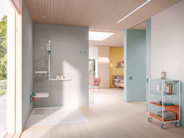
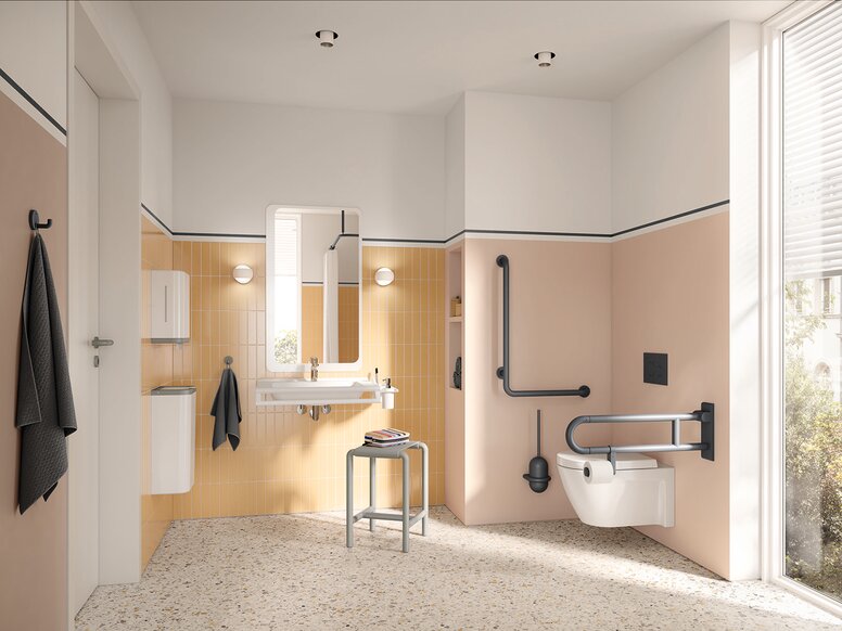
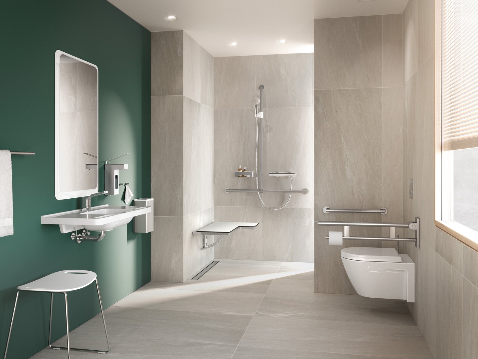
There is no reason why bathroom safety products have to be ugly. Hewi has proven this, and we wholeheartedly agree. That is why we use HEWI's aesthetic and functional sanitary solutions for our projects. For us, preventing falls in the bathroom starts by providing convenient, confident touch points across the space. Every horizontal surface must be a grab surface, whether it’s a toilet paper holder, a towel bar, a sink, or well, a grab bar. These items should enhance safety and contribute to the aesthetic of the room. Declining vision is common and an often-overlooked problem with widespread negative consequences…such as falling! Therefore, high contrast finishes that clearly differentiate all three planes (floors that contrast with walls, that contrast with grab bars, that contrast with ceilings) is essential for keeping patients upright and aware of their place within their surroundings. High contrast also means less beige. Color is uplifting and serves a real purpose. And with a focus on elder patients in healthcare, there is a discreet need to compensate for the declining visual acuity that is caused by the yellowing of sight. Aging eyes require three times more light than a young person’s eyes, which means we need to design products with embedded lighting and interior spaces that have great ambient light, ensuring we prevent bright spots and dark spots. Aging and illness often reduce dexterity, mobility, and mental acuity. It is for this reason designing for simplicity is essential in healthcare environments, especially bathrooms. This manifests with fewer moving parts, obvious touch points and clarity of purpose. Design strategies like these also deliver on the goal of reducing the spread of infection, as this leads to fewer surfaces that are easy to sanitize.
For too long, healthcare facilities have devoted construction budgets to areas that appeal to donors as opposed to patients. While often impressive, dramatic lobbies rarely contribute to healing. We advocate for patient rooms that are beautiful, colorful and provide improved safety. Michael Graves Design is committed to enhancing people’s lives through healthcare designs that:
- Are unique and make people smile (Delightful)
- Are inclusive, understandable and function flawlessly (Purposeful)
- Address previously unmet consumer needs (Pioneering)
- Exceed people’s expectations by focusing on even the smallest design details (Extraordinary)
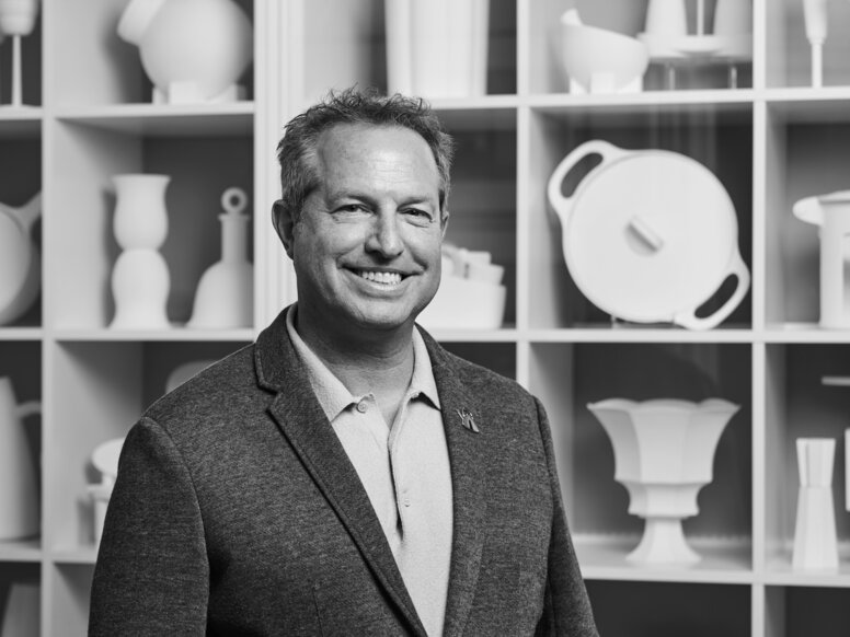

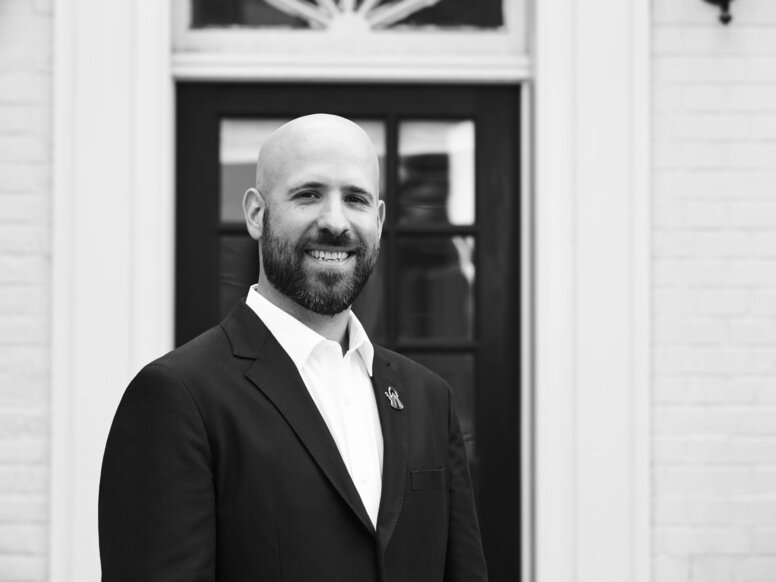
The authors
DONALD STRUM
With the firm since 1984, Donald is the Principal in charge of product, furniture, and graphic design. His first project for the firm was the “Whistling Bird Teakettle” for Alessi. In 1997, under Donald’s leadership, the firm began a relationship with Target Stores that led to what many in the press have hailed as “the democratization of design.” In 2005, after witnessing the issues Michael Graves was experiencing with an illness that left him paralyzed, Donald and the product design group made a commitment to transform healthcare design for the aging and physically disabled population. Donald and the product design group have brought thousands of products to market over the past three decades.
ROB VAN VARICK
With the firm since 2003, Rob passionately believes design has the power to positively impact people’s lives. His mission is to apply the right blend of research, psychology, creativity, and strategy so that root causes are identified, allowing the best solution to be designed. Well-rounded solutions require multi-disciplinary input and collaboration. As a partner at Michael Graves, Rob works with architects, interior designers, product designers, graphic designers, researchers, and strategists who are all focused on one goal: enhancing the human experience at every scale. Rob believes that great design is humanistic, familiar, accessible, and intuitive.
BEN WINTNER
With the firm since 2002, Ben is the General Manager of the product design, graphic design and research & strategy practices of Michael Graves. Ben is responsible for strategy, brand management, and financial planning. He plays a critical role in the management and strategic planning of the Michael Graves Design consumer brand, as well in the development and implementation of the firm’s healthcare design strategy, which was driven by Michael Graves’ personal health crisis and subsequent passion for patient centered healthcare design. Ben develops and manages rela-tionships with the firm’s client and is integral to the strategic development, management, and execution
ABOUT Michael Graves Design
Michael Graves Design exists to create moments of joy that enhance people’s lives by offering products that are delightful, purposeful, pioneering, and extraordinary. Michael Graves is one of the leading design practices in the world, offering services in product design, graphic design, architecture, interior design, branding and related services.
Download now for free
Get new perspectives on universal design, be inspired by architectural solutions, and discover how creatively accessibility can be designed!
Download your personal issue as a PDF for free.
